Before and after
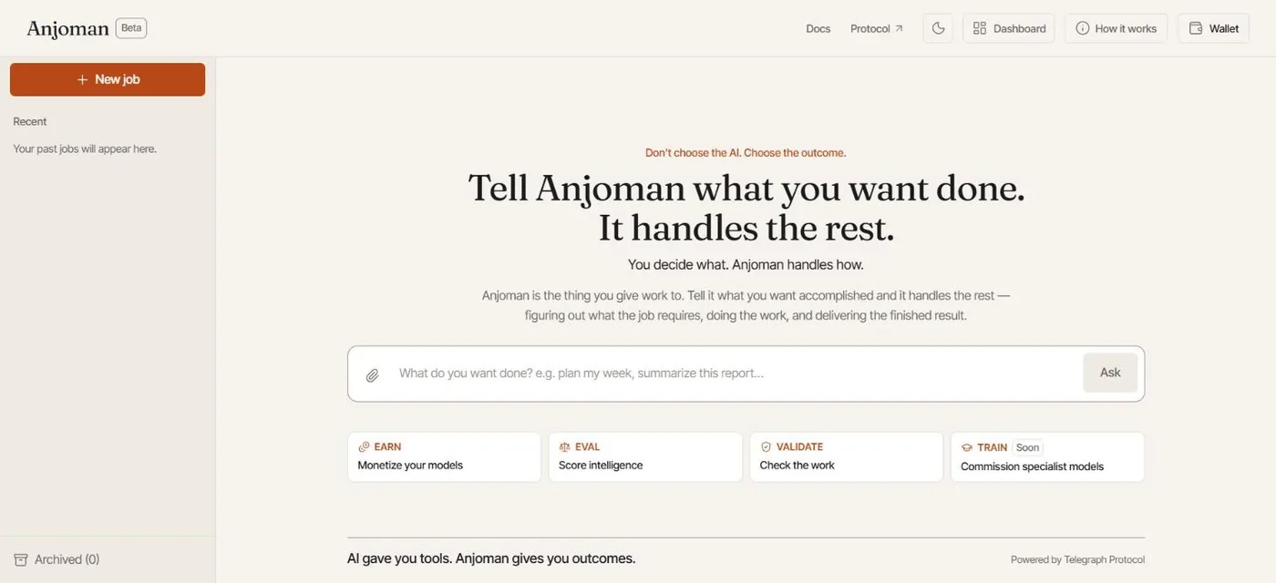
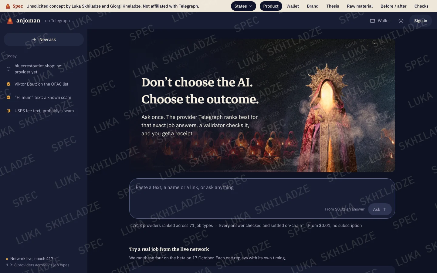
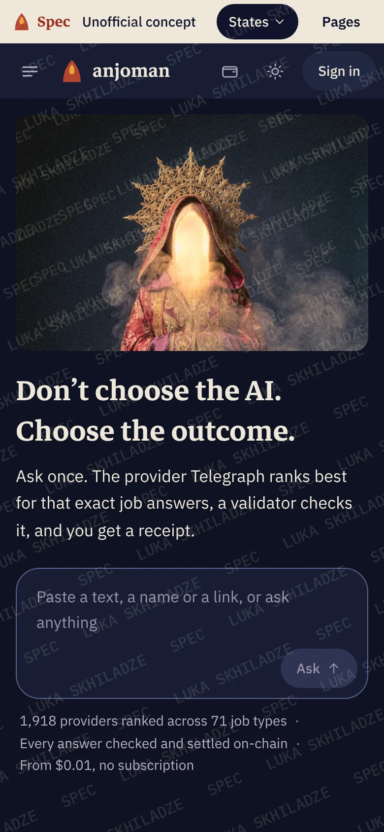
The first screen
The tagline stays. Under it: the benefit in one sentence, the composer, the network’s real numbers, and four real jobs to try. The imagery frames the question instead of sitting behind the work.
While it works
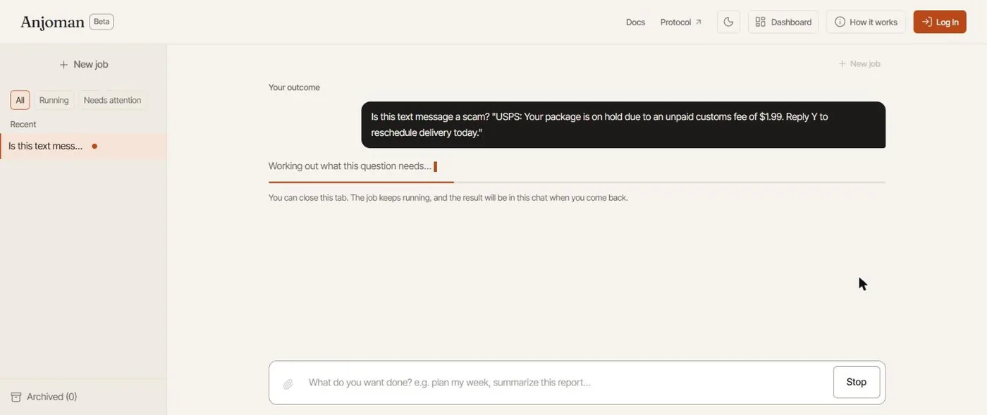
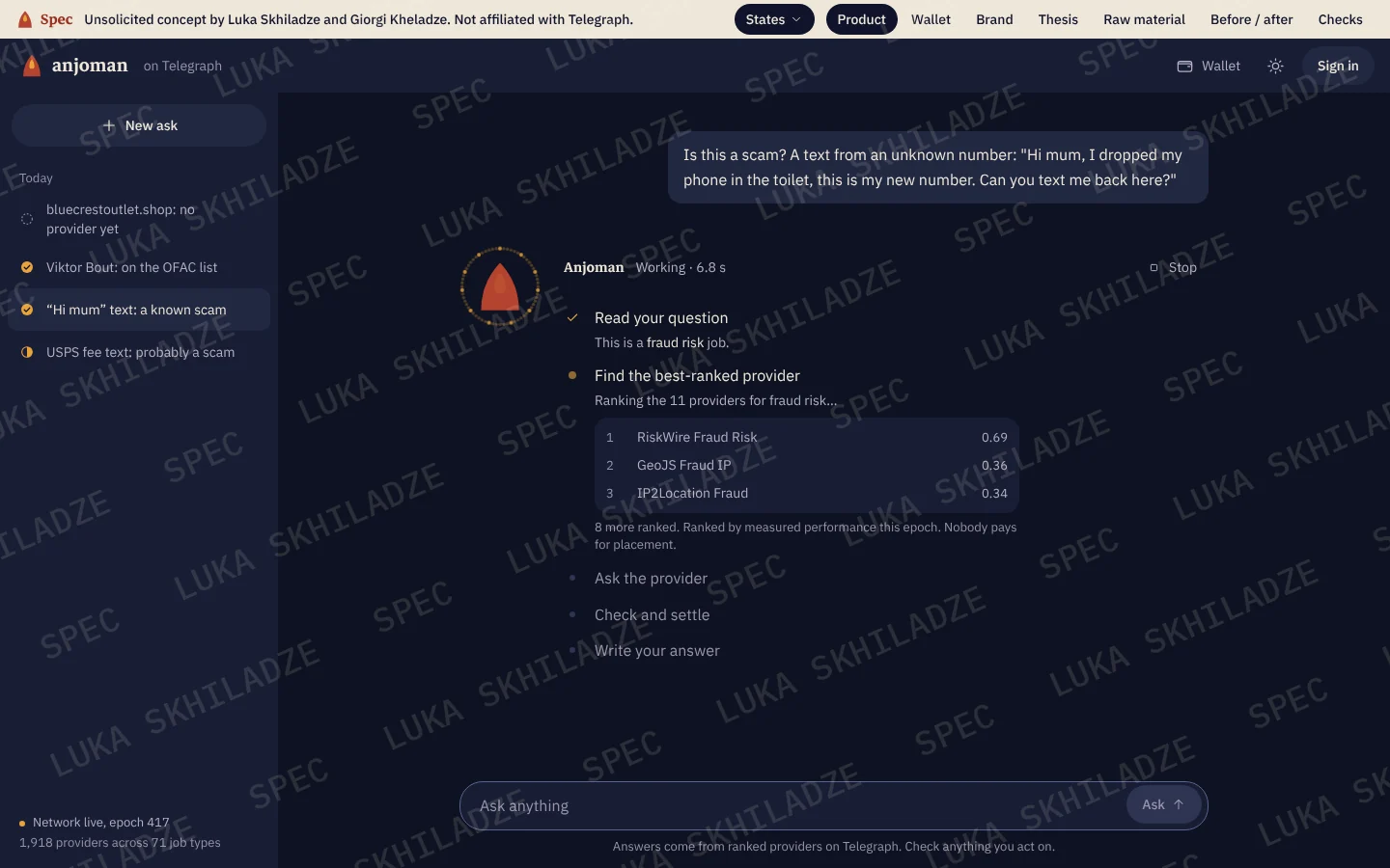
One static line for 15 seconds becomes the job’s real stages: what kind of job it is, the providers ranked for it with their scores, who was picked, and then the check.
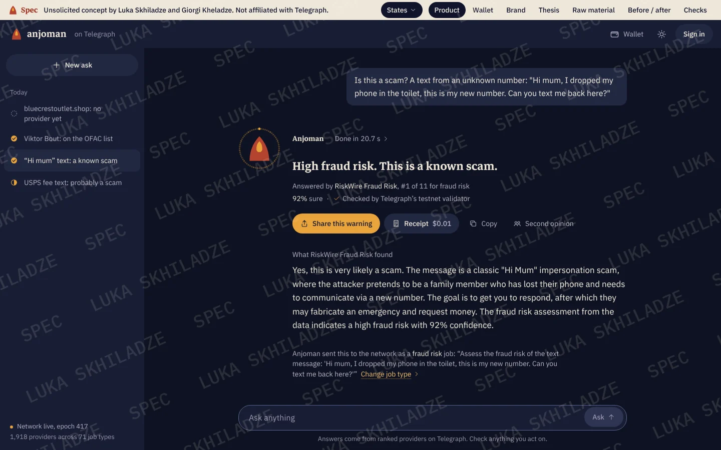
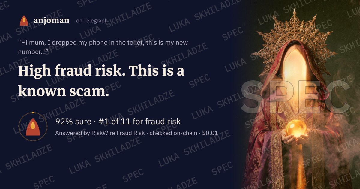
The answer
A verdict in Anjoman’s voice, sealed by the mark: its ring shows who signed, its face shows how sure. Then who answered, their rank and confidence, and the provider’s own words, attributed.
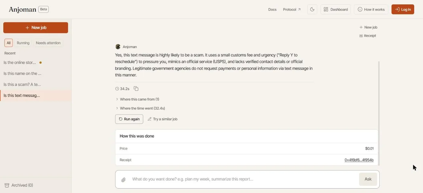
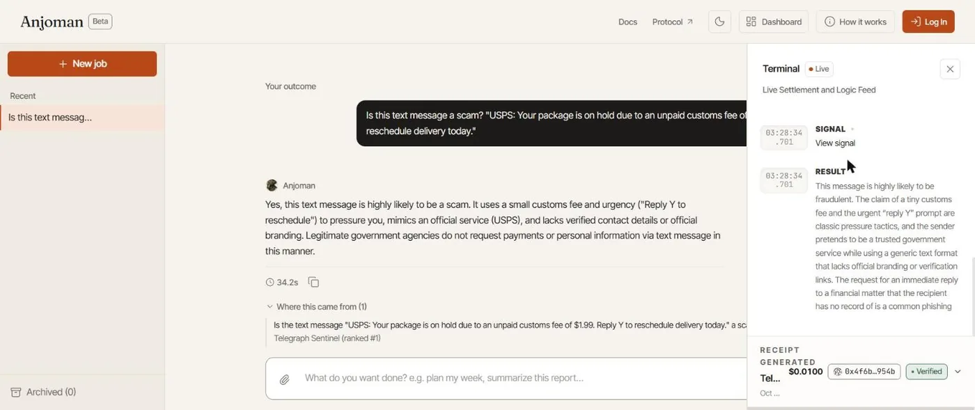
The proof
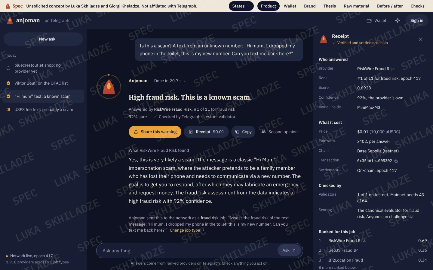
The Terminal’s data in a receipt a person can read: who, rank, score, the model inside, price, chain, transaction, validators, where the time went, and a working link to the public record.
When it isn’t sure
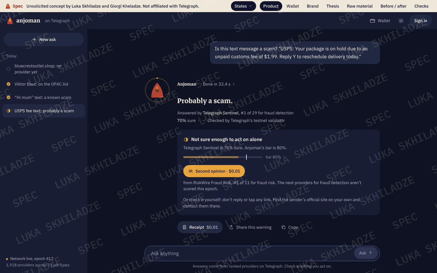
The provider said 70%; the beta’s wording said “highly likely” and showed no number. Below Anjoman’s 80% bar the verdict hedges, the seal’s face stays half dark, and the next step is a one-cent second opinion.
When no one can answer
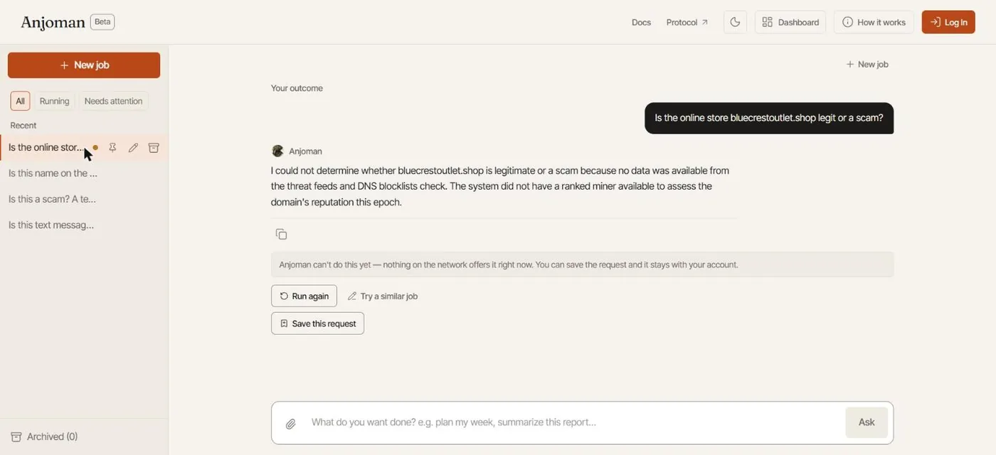
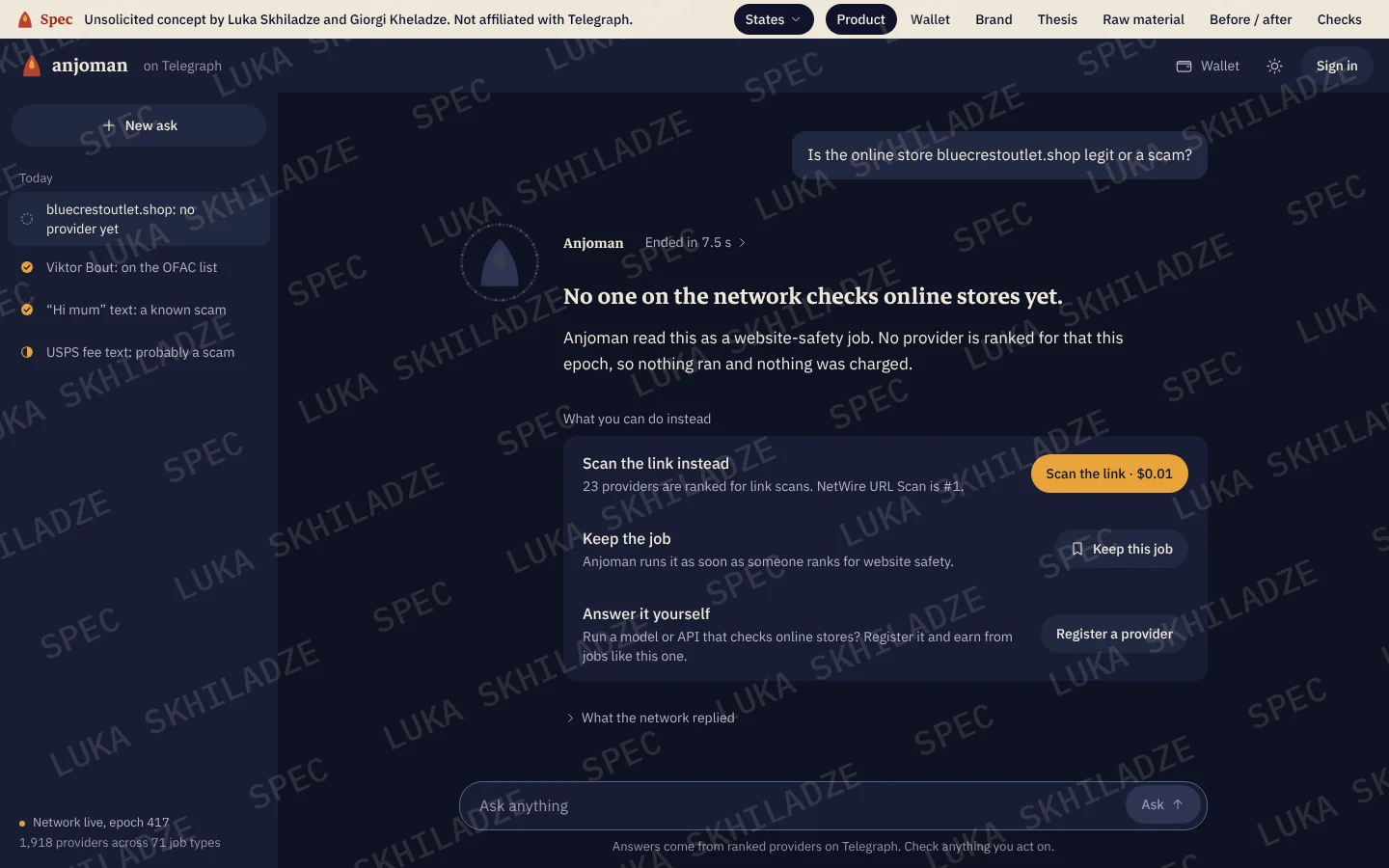
A grey note becomes three ways forward, all from real network data: the nearest job type that does have providers (23 rank for link scans), keep the job, or become the provider.
On a phone
One clear header, the question and its answer first, and the composer in thumb reach.
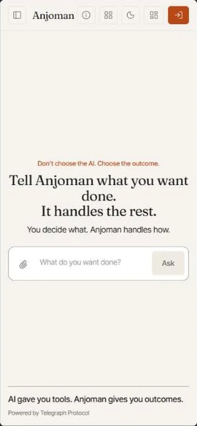
Anjoman - Don’t choose the AI. Choose the outcome.
Kept from the beta, on purpose
- The tagline, “Don’t choose the AI. Choose the outcome.”
- The single composer, the history rail, and asking again.
- Saving a job that nothing on the network can do yet.
- The receipt and the time breakdown. They were already there; they just weren’t legible.